2015年11月26日 星期四

Space

In the past few weeks, we talked about some elements of graphic design. Honestly speaking, I found that I can't mention all the meanings of elements in just 10 weeks, let alone demonstrate the use of this things. But the things I've talked about is still useful, I think I'll choose to talk about the application of the things I've posted before in the final presentation. Let's home into our topic today.

Besides figures in the picture like lines, shapes, texts and so on, we are often unaware of the space around those figures, or we can call it 'ground' since it's like the background of a picture and we put less attention on it. Actually, ground is as important as the figures. It doesn't only provide the place for our eyes to rest, it can also separate and highlight things. For instance, the space between words separate words from each other, and the bigger space around one paragraph separate each paragraph. Moreover, the larger the space is, the more we'll notice the little figure in the picture.


Also, the distribution of the space may give you different feelings. Think of the luxury purse with just a brand outside and it becomes so desirable and also hundred times expensive than the night market one(夜市).


The space outside the Louis Vuitton purse set off the its logo and gives you a sophisticated, luxurious and clean feelings.


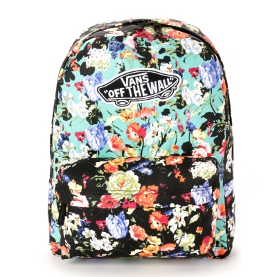
On the other hand, though the bag with flower looks great, it doesn't give you the luxurious, simple and clean feelings. In contrary, it shows vigor, complex and the rich color of the flower. Regardless the use of colors of two different picture, you may find what we feel from the bag is quite different.

For more details about the use of figures and ground, maybe I'll mention it in my final presentation. That's it for today and thank you for your reading. See you next week.

2015年11月19日 星期四

Line

Hello every one. Welcome to my blog again. This week I'll introduce the meaning and the use of line to you. Since the article may be a bit longer, I'll choose to use some more pictures to represent my ideas. Wish you can enjoy it.

There are many many things related with line in our world. I'd like to divide it in to two groups which are straight lines and combined lines and curves.(在這篇文章裡面我想把這些線分成單純的直線和不是單純的直線)


- Straight lines -


The uncombined straight lines will have some implicit meaning to us. Like the edge of the tall buildings may give us the feeling of power and strength, while the horizontal edge between ground and sky may let us feel quiet, peaceful.


Besides the edge of different object, lines can use to divide or classify data and information.


Also, a simple line can show the tendency of something. For instance, though the experiment data can seem nonsense, but with the tendency line, we often find some rule inside the complicated data. (The picture is just an example.)


- Combined lines and curves - 


Combined lines and curves are more close to us since most of things aren't all straight lines but combined curves and lines. Though we won't see an obvious black line edge on many things, but the different color of  that object and its surrounding things may still have a blurry edge. It is the edge that ancient people drew it down on the rock to record what they'd saw.


Today, we still use the same way to write down our thought with simple lines. The differences are the way we write today is easier and more systematic but lack of the real shape of the real object. 


Since lines can portray almost any thing we could see, it's an important element in graphic design. By using curves and straight lines, we can show any thing we want without using a single letter. In comparison to the simple straight line, combined lines and curves are more energetic and artistic. Almost everything in the computer is made of  lines. Maybe there are lots of shapes in there but they can be seen as a linear frame filled with colors. Not to mention the designed graphic in our everyday life.


The uses of lines are too many to count. But there's an unchangeable thing that it is the base of any other shapes or art works in the world. It's hard to tell how we use it in our design with just one article. But if you pay attention on everything you see in a day, you'll definitely find something about the use of line. That's it for today. Wish you have a happy weekend.

2015年11月12日 星期四

Color 3

I wish I could graduate from the department of chemistry since I may possibly fail most of my exam this time. As I'm very depressed because my poor grade, I'll try to choose some dark and cool color to show my depression.


But why we feel depressed when we see the cool and dark color?  Let's look at the same picture with a warm color.


Well, although this may seem depressed, but if we assume that he just want to stay away from the sun. It looks fine with the same pose and background. The different feelings of different colors are  all because it's implicit meaning to us.

Think of a lovely morning with yellow warm sun light. When you're under the warm sun, you'll feel that everything is o.k. and you can handle another exhausting day.

But if you find that it's raining outside when you wake up, maybe you'll just stay in your bed and sliding your smartphone all day long. Because every thing looks troublesome and you don't want to take your umbrella walking in a windy rainy day.


Through our experiences in our daily life, we often have special feeling about some of colors around us. Besides thinking of certain object, maybe some of your past or emotion or your depressed high school day with little but continuous rain will be evoked. Since one or a series of colors can give us a special emotion, we often see the application of color using in our everyday life. Like the coca-cola's red may give you a feeling of youthful, energetic and passion, or the yellow of 一信麵家(?) may provide you an expression warm and delicious food. This are all the power of colors.


Since it's close to midnight now, I think I'll stop this topic at here. 'Maybe' I'll add some more things and pictures in this article before Saturday, so you can visit here again at Saturday or just leave a comment below to finish your weekly response. At the end, I wish you and me can all pass the devil like mid-term exam.

2015年11月5日 星期四

Color 2

Hello everyone, I'm glad that you come back to my blog again since we're close to Mid-term exam. This week we'll choose one color(red) and talk about the connections between the color and things. Since I'm running out of time, some implicit meaning of the color and other things will be mentioned on the next few weeks. Hope you can enjoy it!

- Colored things -

Let's look at a picture first.

What would you think about at the first glance? Sun? or a flag of Japan?


This is an example to show how color connect with different shapes. When the color is combined with shape, it is very easy for us to identify what does it mean. And this connection always help us to recognize things more quickly and correctly. Notice that there's a not to do sign above, it's a good example that we build combination between color and the sign made by people. Here's another picture.


Through this picture, I think it isn't hard to find that we're already combined the red color to these trade marks since we saw it on the ads, TV commercials, web pages again and again. The use of color on the trade marks gives us a special feeling when we saw the common trade marks. For example, we'll think of piano or motorcycle when we see Yamaha, or think of happiness and cool soft drink when we see Coca-Cola.

Besides red, we have more colors being used in our everyday life. And there are thousands of things related with color on the world. Thus, our world becomes more colorful and beautiful.

This is the end of the article. Finally, I want to ask some interesting problem. Have you ever thought about why Coca-Cola use red as it's trade mark color?  or why the color of shop signs at xiao fuu 2F(小福二樓) are often red and yellow? We'll find out next week.