- Serif v.s. Sanserif -
Let's see some examples of serif font and sans-serif font first.

Serif(襯線體) means the width or the shape of a stroke will change as you write. Also, there may be a small line attached to the end of a stroke. Generally, serif font is easy to read through, more formal and we often choose this style to write an article.

This is the content of calculus textbook.

Sanserif(非襯線體) means the width or the shape of a stroke will NOT change as you write, and it is seldom attached by a small line. Contrary to serif font, sanserif font is hard to read but it can draw people's attention. So it is widely used for shop signs, topics and advertisements.
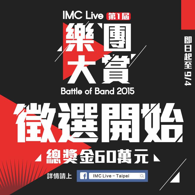
This is a poster about music contest.
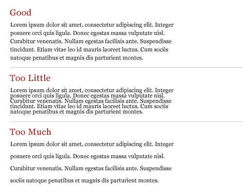
‘Leading’ means the space between row and row. A proper leading can make us read through the whole article easily. However, if the leading is too short , you'll find it difficult to move your eyes from one row to another.
‘Tracking’, means the length of a word. A proper tracking can help you identify the word quickly and correctly. If the tracking is too short or too long, it may take you more time to recognize the word.

If we try to change the tracking of a word, the space between letters will increase equally.
‘Kerning’ is to modify the space between one letter and another to make one word looks more comfortable. For more information please check → #Wikipedia

The above one is the original one, and the lower one has kerned. We can see that the space between A and V is to big, so we change the space between A and V to make it looks better.
This is all for today. Thank you for reading this long article. By the way, because I'm running out of time so I don't have enough time to share my dinner with everyone xdd.
Wow~ so useful! My eyes are comfortable after reading your blog~ I think my articles in my blog were lack of 'the leading', so it was hard to read. Next week, I will revise it.
回覆刪除No matter what kind of font that calculus textbook use, it is still hard to read.
回覆刪除YOU CAN SAY THAT AGAAAAAIN
刪除QAQ
刪除It is interesting to know something about typography! Thx for your sharing!
回覆刪除I haven't heard of typography before. Thank you for sharing this interesting topic.
回覆刪除